Chronos Studio

A studio I co-founded with Winnie Ledu in late 2024.
In late 2024, Winnie Ledu and I co-founded Chronos Studio. The goal: rethink luxury product photography for brands that need variation, speed, and creative range without the cost and lead times of traditional production. Day rates for premium shoots sit around $5,000, before retouching. Timelines stretch over weeks. For brands needing seasonal cycles or multiple variations, the model breaks.
As Technical Director, I built the workflow that powers the studio. Real photography and proper retouching as the base. AI tooling layered in for variation, environments, and adaptation work. Seven years of retouching for luxury spirits informs every output: light, glass refraction, surface, color. The technology is in the pipeline. Humans drive every call that matters.


The
vision.
The problem with traditional production
Traditional product photography is heavy. Studio bookings, lighting crews, multiple shoot days, weeks of retouching. For brands needing variations or seasonal cycles, the model doesn't scale. Winnie and I started Chronos to build a faster, leaner alternative without sacrificing quality.
The Chronos approach
As Technical Director, I built the full workflow: photography, retouching, AI enhancement, multi-format output. The AI sits inside a process where every output is reviewed by a human. Glass refraction, surface, color, composition. None of that gets handed off to a generator.
Two service tracks: transforming clients' existing photography into lifestyle imagery, or running full in-studio production from concept to delivery. Same workflow, different starting point.
Why it works
Chronos is a hybrid practice. Real photography and retouching as the base, AI as a multiplier. My years in spirits branding inform every visual decision. Winnie's eye on packaging keeps execution tight. A small studio built for premium output at speed.

The
innovation.
Photography first, AI second
Chronos pairs traditional photographic work with AI tools configured for luxury product visualization. This is not about generating images from scratch. It's about layering AI on top of real photography to expand environments, generate alternates, and adapt for channels.
My role: building the workflow end to end. Initial photography, retouching, AI enhancement, format adaptation. Every visual goes through quality control before it ships, with focus on color accuracy, composition, and brand consistency.
Two flexible approaches
1. Transform existing photography. Clients send high-resolution product images. We turn them into lifestyle photography, alternate environments, or seasonal variants. Built for brands with large catalogs that need to scale without re-shooting. I oversee creative direction and technical execution on every piece.
2. Full in-studio production. When clients want maximum creative control, we run the full shoot in our studio. Chronos operates as a digital-nomad studio: our gear travels with us. Original photography with proper lighting, custom detail shots, then enhanced through the same workflow for adaptation and variation.
The workflow
The pipeline integrates AI tools configured for luxury product work, paired with manual retouching at every step. I personally review color accuracy, validate brand consistency, and make the final call on every image before delivery.


Powered by
People.
The brief
Powered by People came to Chronos with two artisan brands they distribute: Soli & Sun from the Philippines and Indego Africa from Rwanda. The goal was Bloomingdale's. Their existing imagery, authentic but inconsistent, wasn't going to pass retail QC. We were brought in to bridge that gap.
What we delivered
Over two weeks, we produced 130+ retail-ready images across 35+ handcrafted products. Multiple angles per product, material swatches, lifestyle shots, and full Bloomingdale's spec compliance. All without shipping a single unit. Existing photography went into the workflow, and retail-ready imagery came out.
The takeaway
The project proved the model works under real retail pressure. Artisan brands from Rwanda and the Philippines got access to one of the most demanding retailers in the US, at roughly half the cost and a fraction of the timeline of a traditional retail shoot. Exactly the kind of project Chronos was built for.
Japanese
harmony.
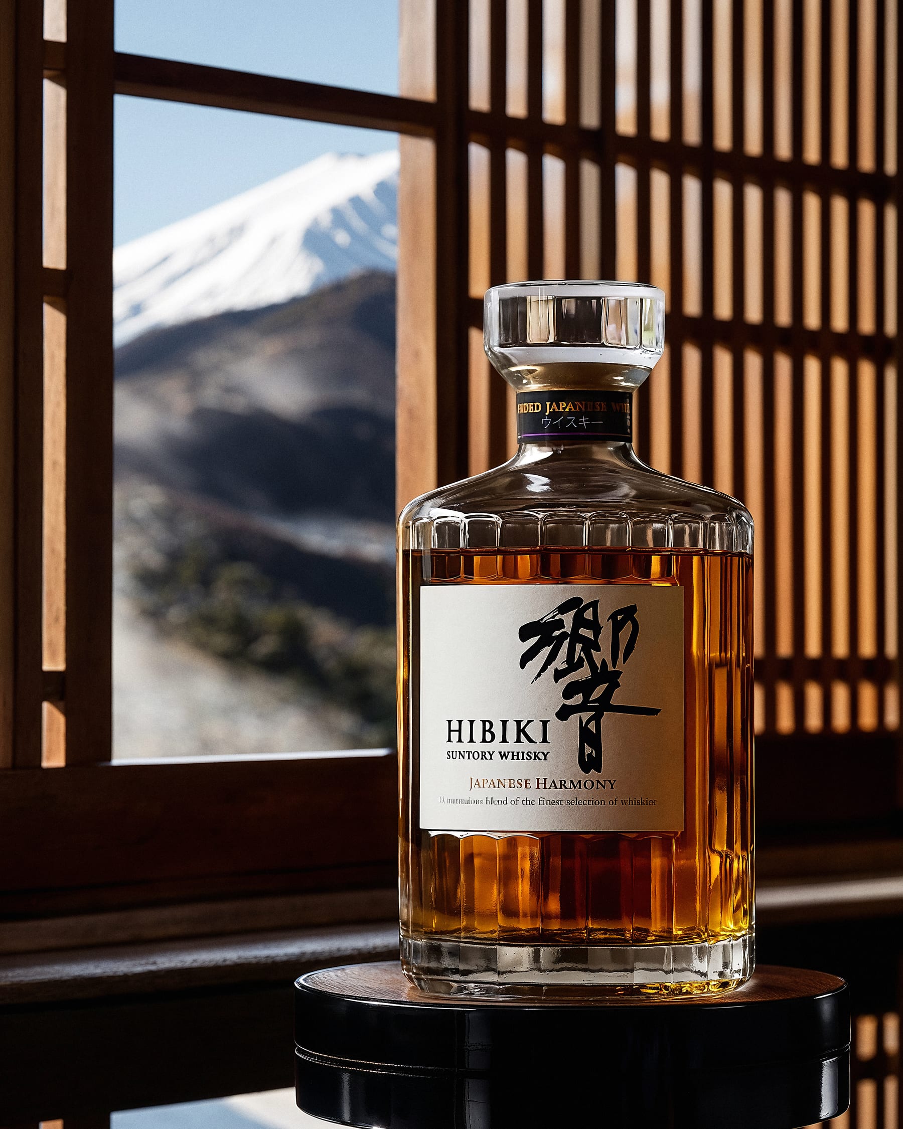
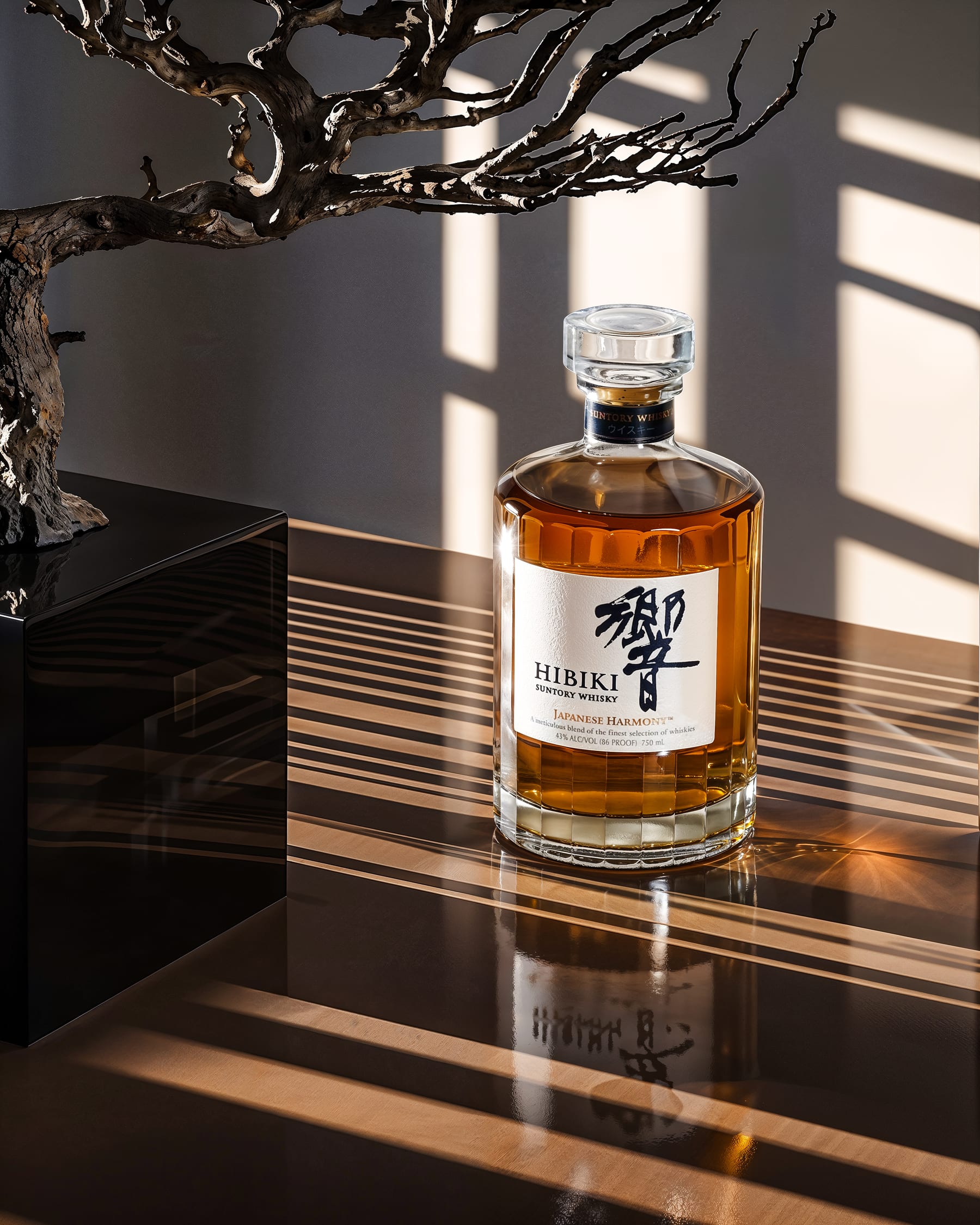
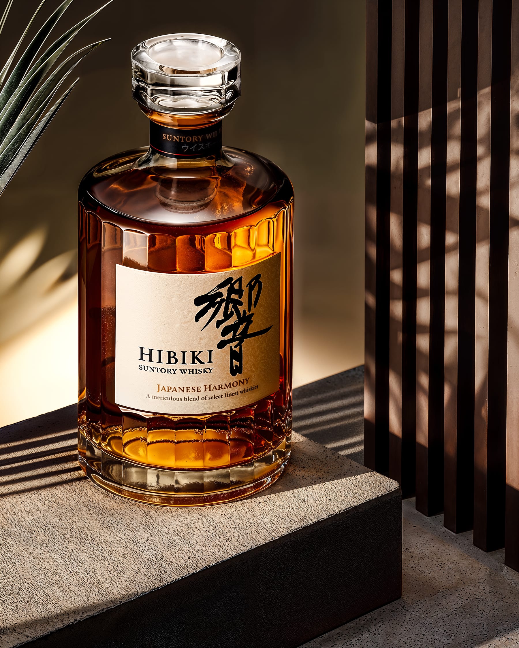
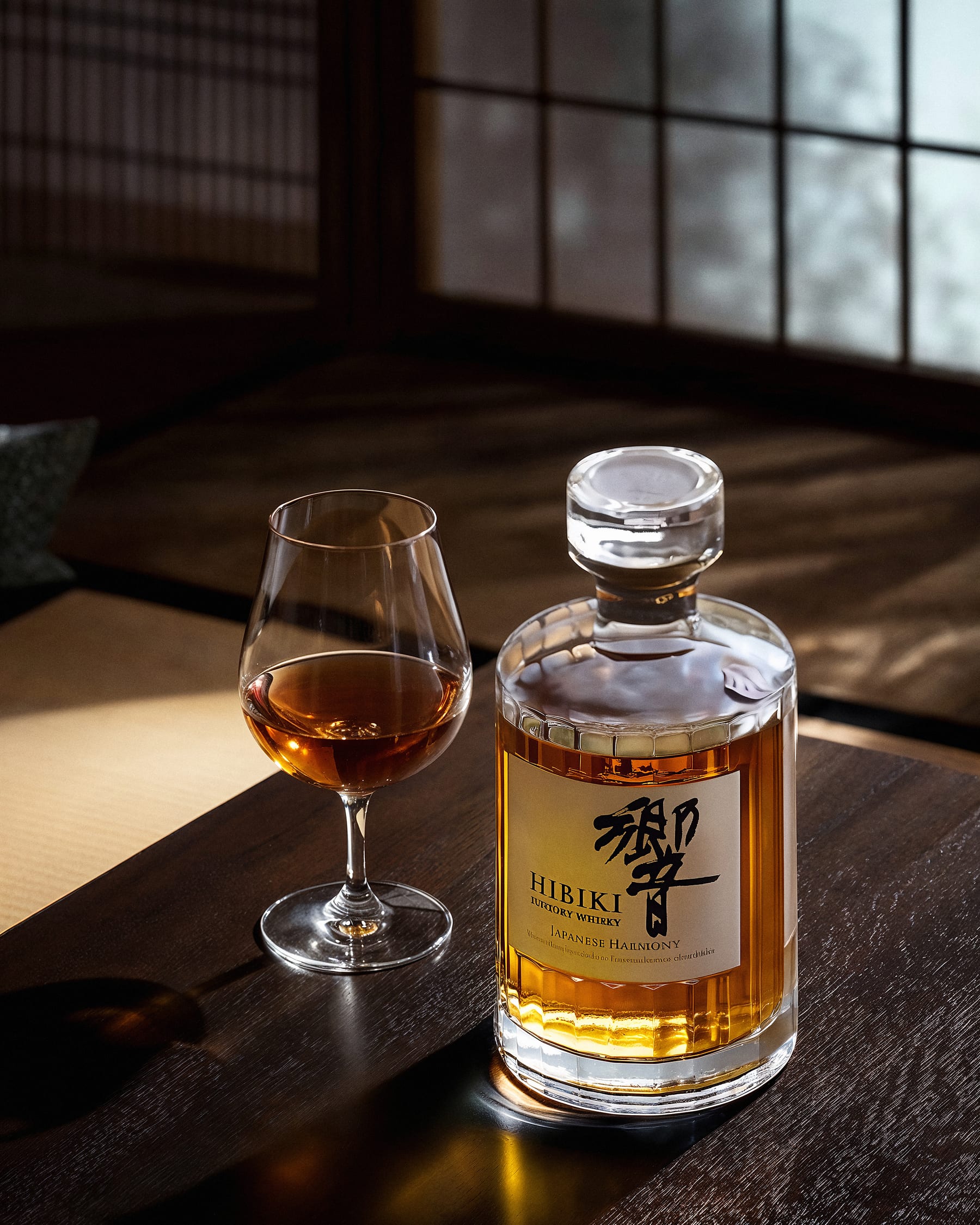
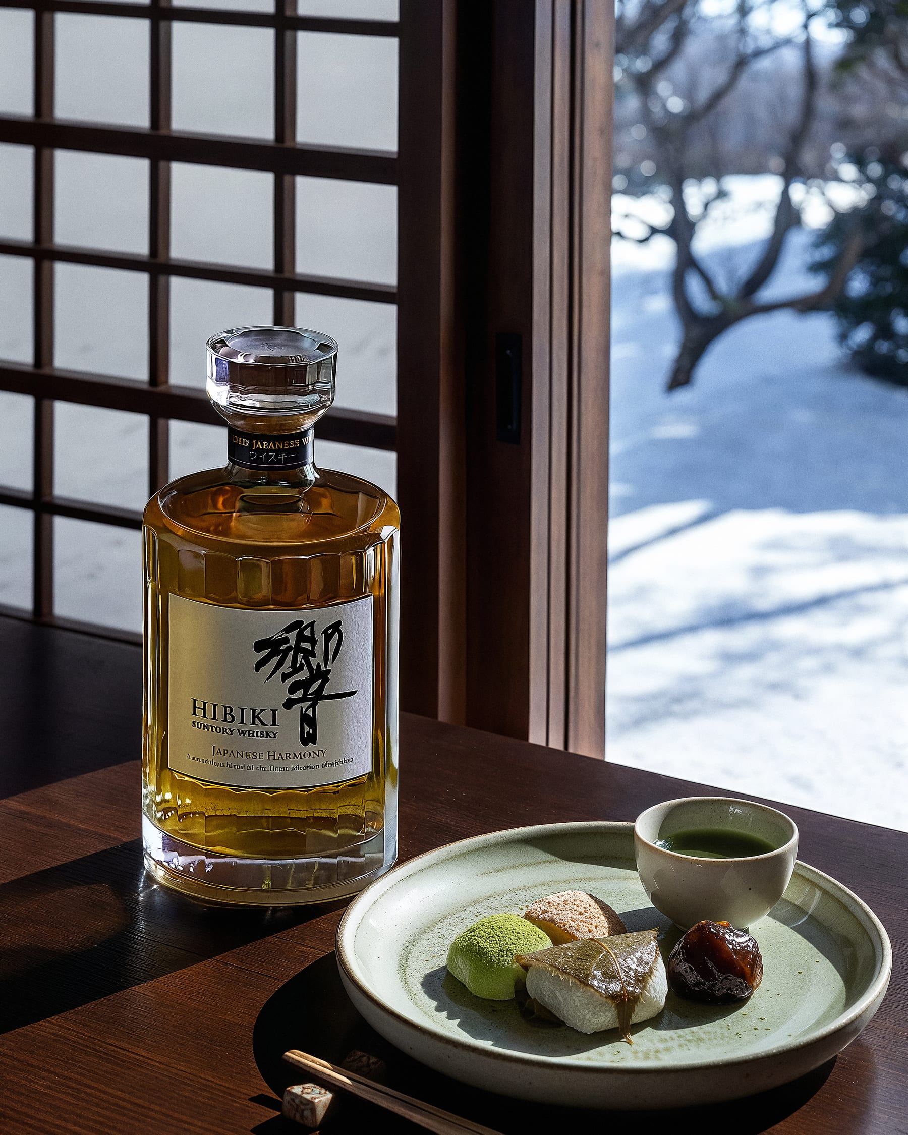
Style study. Reference subject: Hibiki, Japanese whisky.
A study built on restraint and natural light. Compositions reference traditional Japanese interiors: wood lattices, bonsai staging, minimalist surfaces.
The system was asked to hold warm amber tones inside cool environmental light, and to render the bottle's geometric precision without losing the surrounding atmosphere.
The output works across formats, from print to social, and tests how the workflow handles low-saturation premium aesthetics.
Mysterious
by nature.
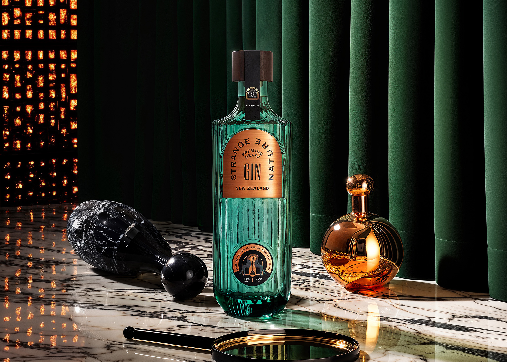
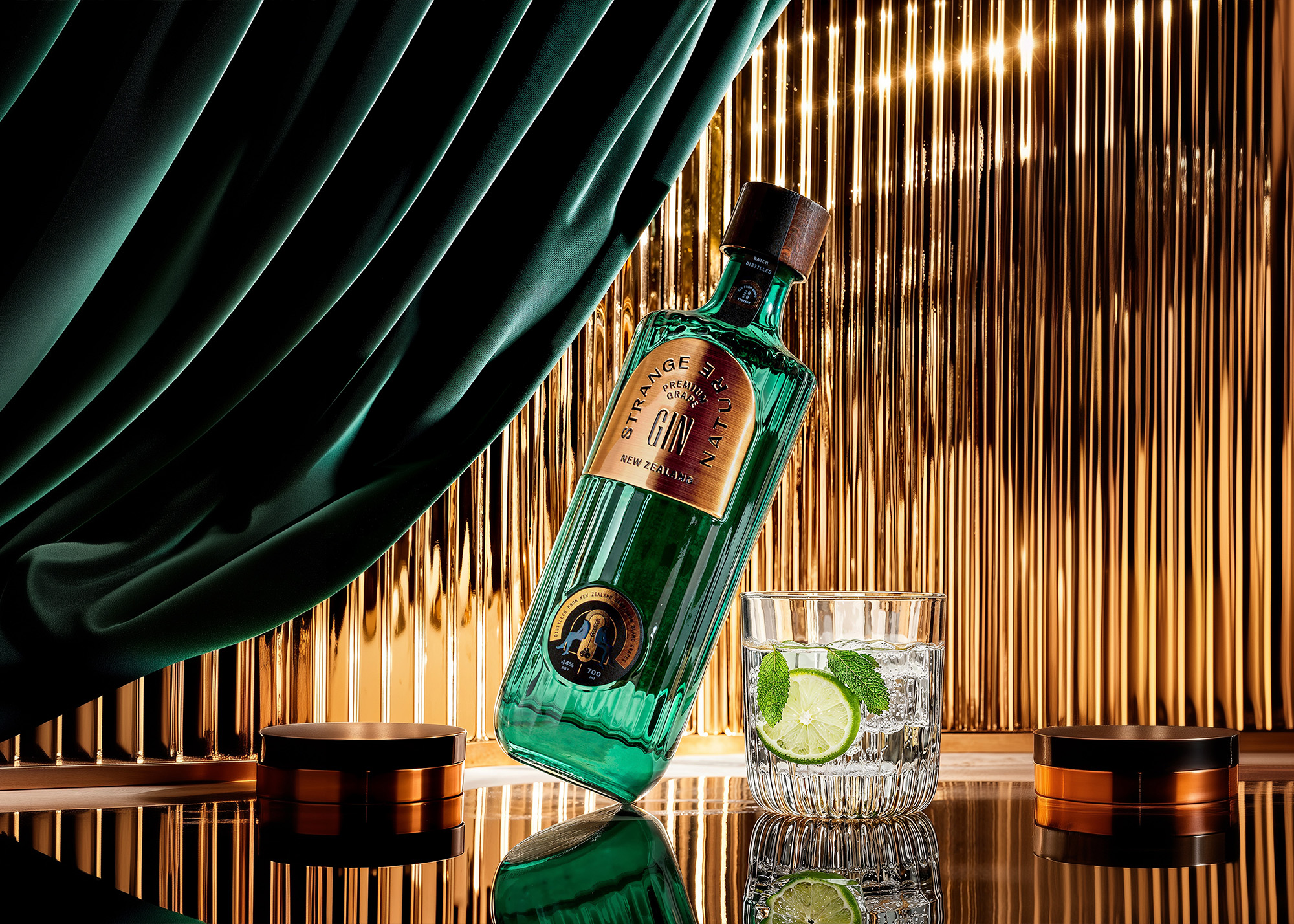
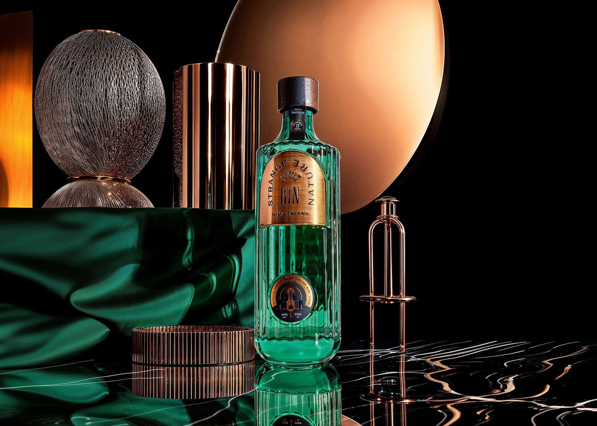
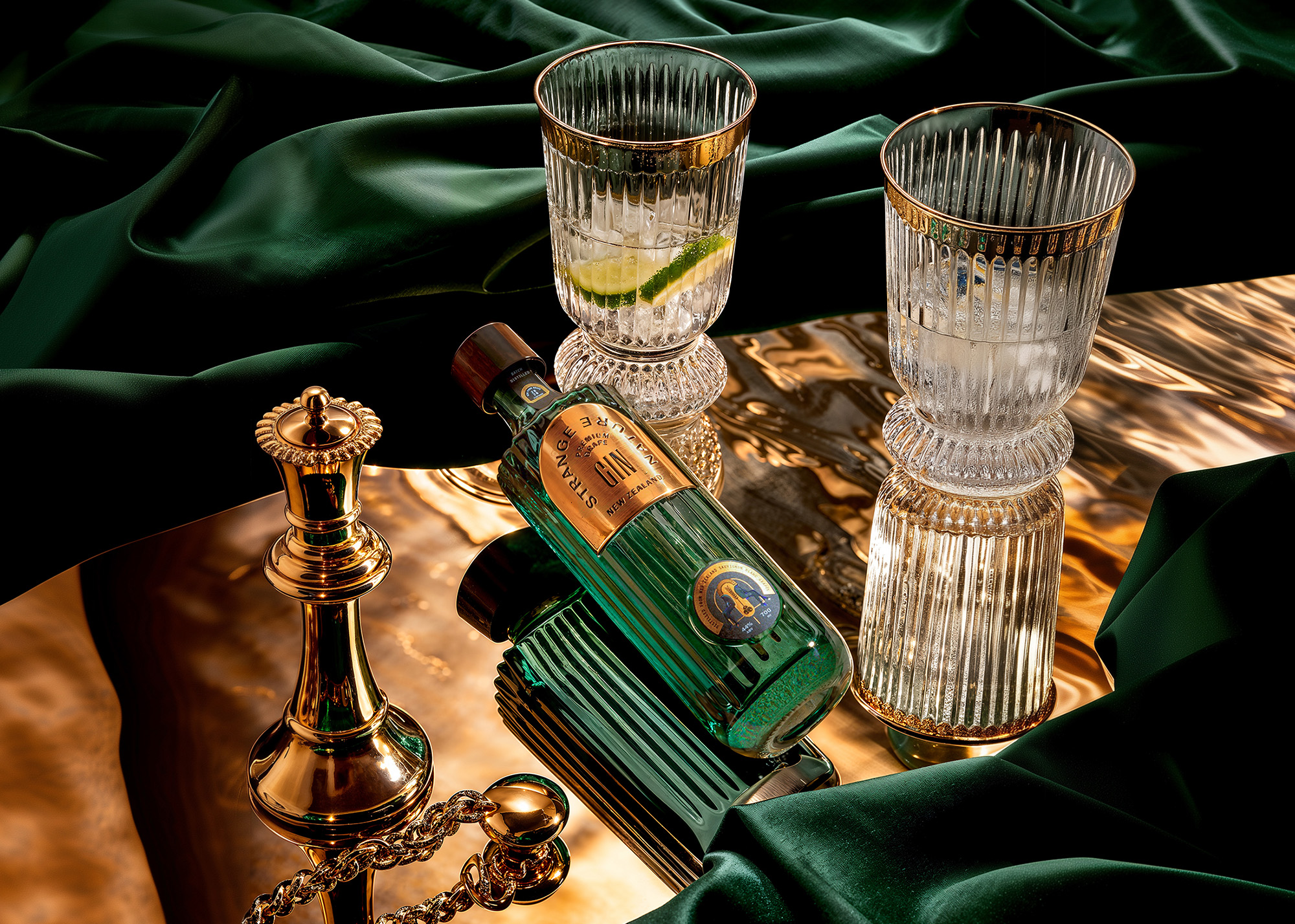
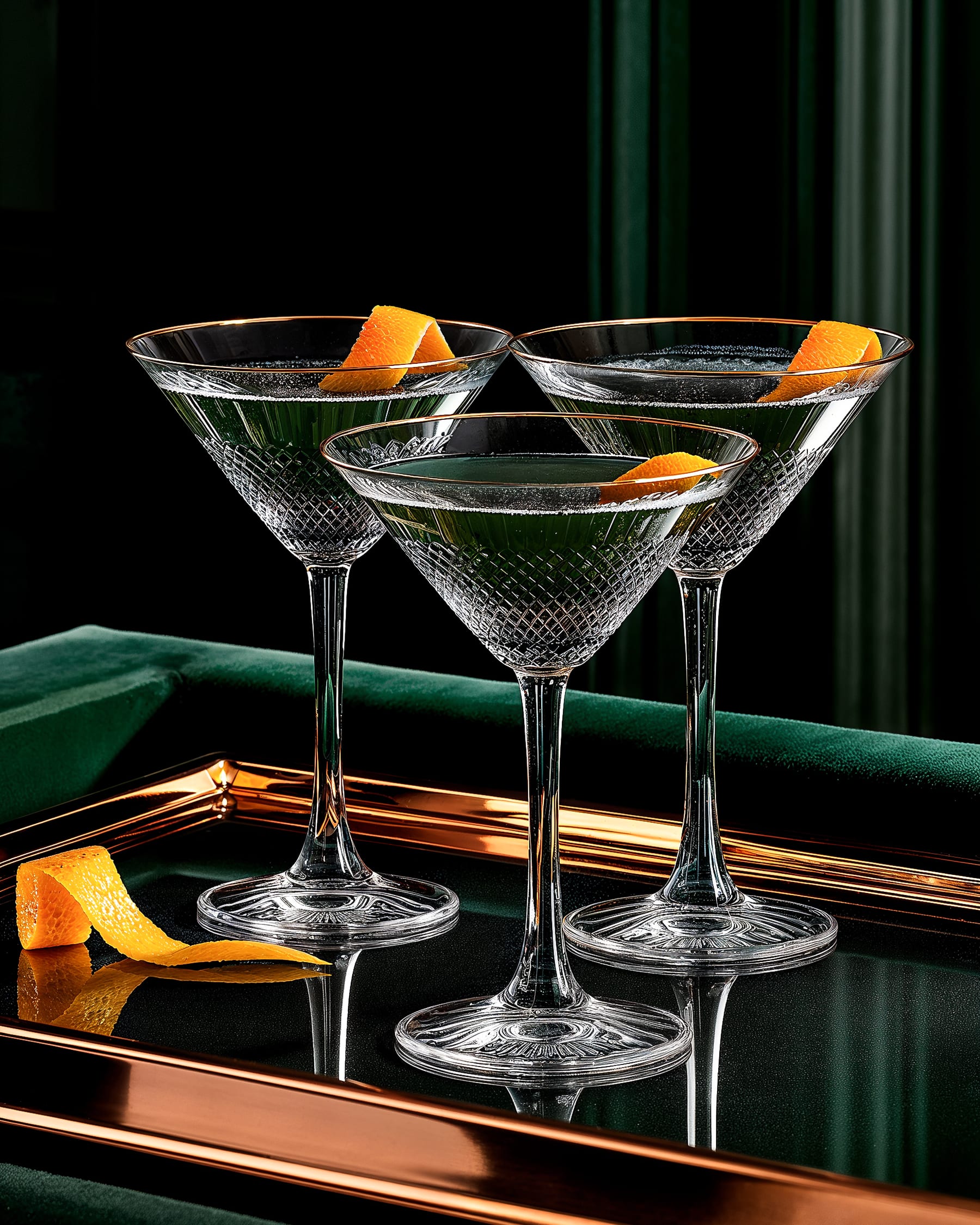
Style study. Reference subject: Strange Nature, New Zealand craft gin.
A test of dramatic single-source lighting against high-contrast environments. Deep emerald and copper against black, ribbed glass catching shadow.
The system was asked to hold premium feel through low-key lighting, and to preserve texture across deep-shadow regions where most pipelines flatten detail.
The result reads atmospheric and dark, deliberately at the opposite end of the spectrum from the Hibiki study.
Timeless
elegance.
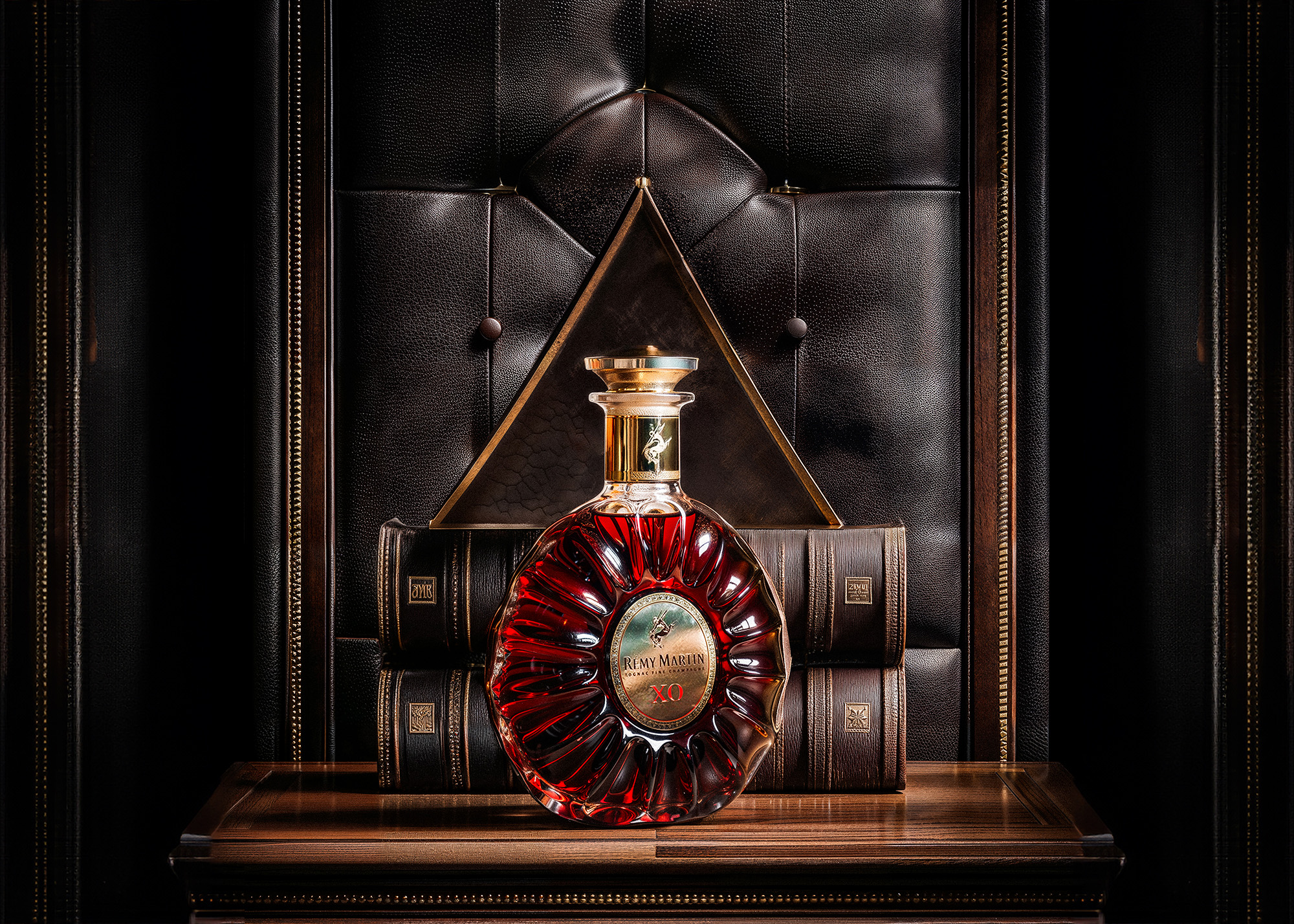
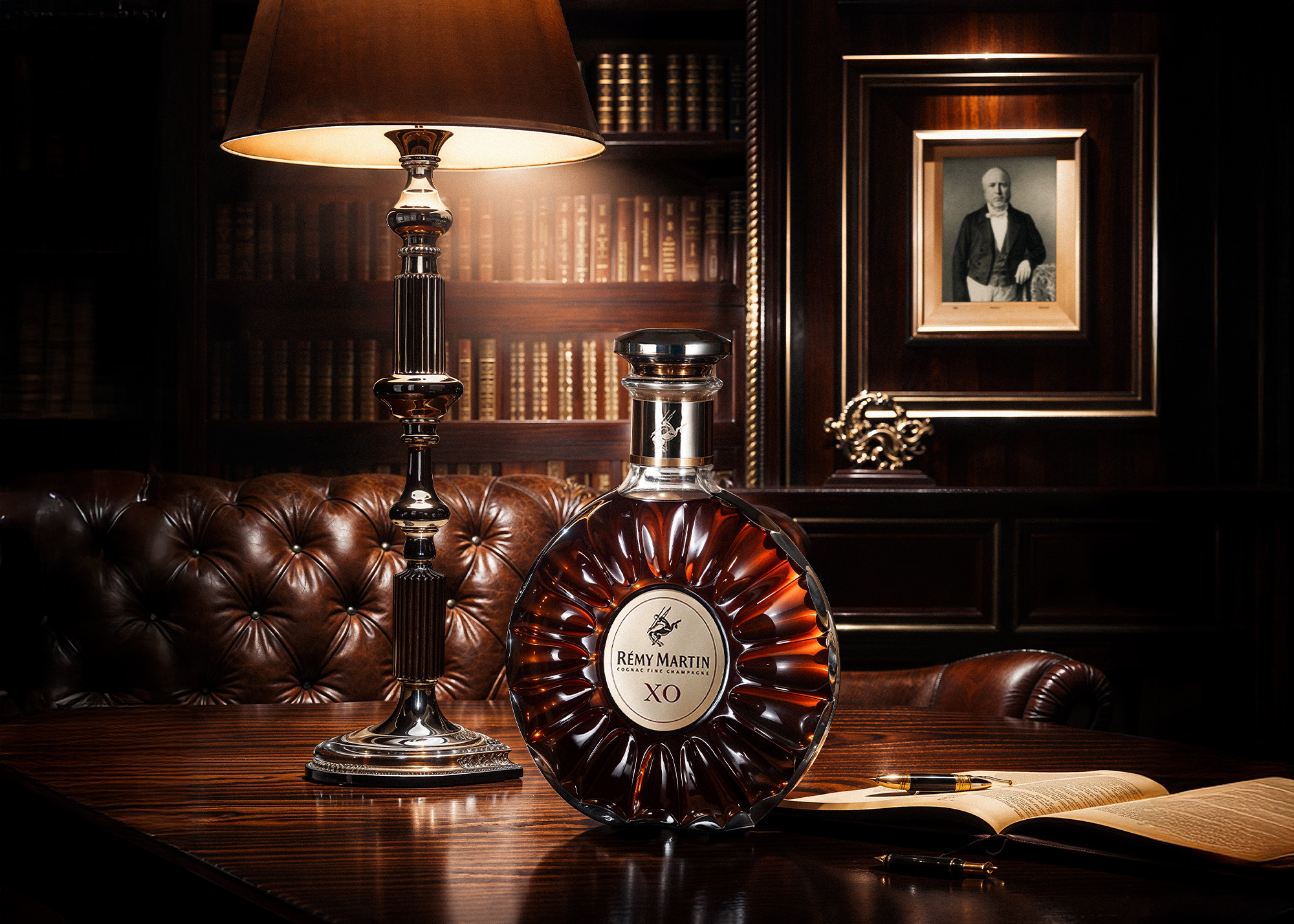
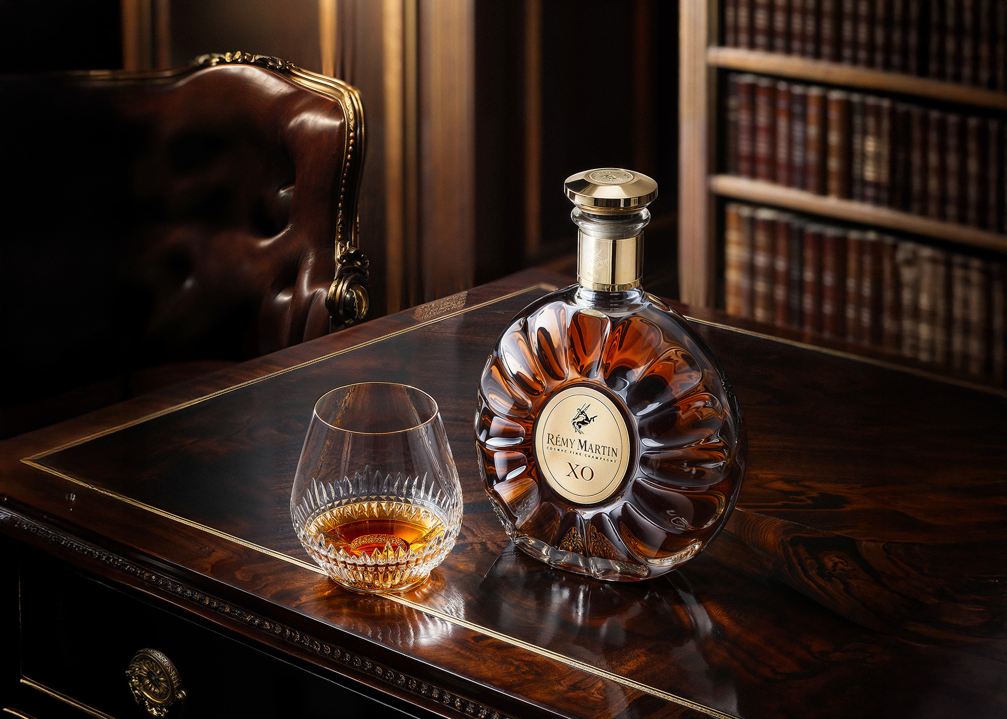
Style study. Reference subject: Rémy Martin XO, French cognac.
A study of warm interior environments and ritual context. Leather, aged wood, lamplight. The kind of setting cognac lives in.
The system was asked to render crystalline stopper geometry and rich amber liquid against complex environmental detail, without flattening the composition.
Output focused on contemplative pace, warmth, and editorial framing for premium print and digital placements.
Beyond Spirits
The same workflow extends across categories. Three additional self-initiated studies in tea, champagne, and watchmaking.
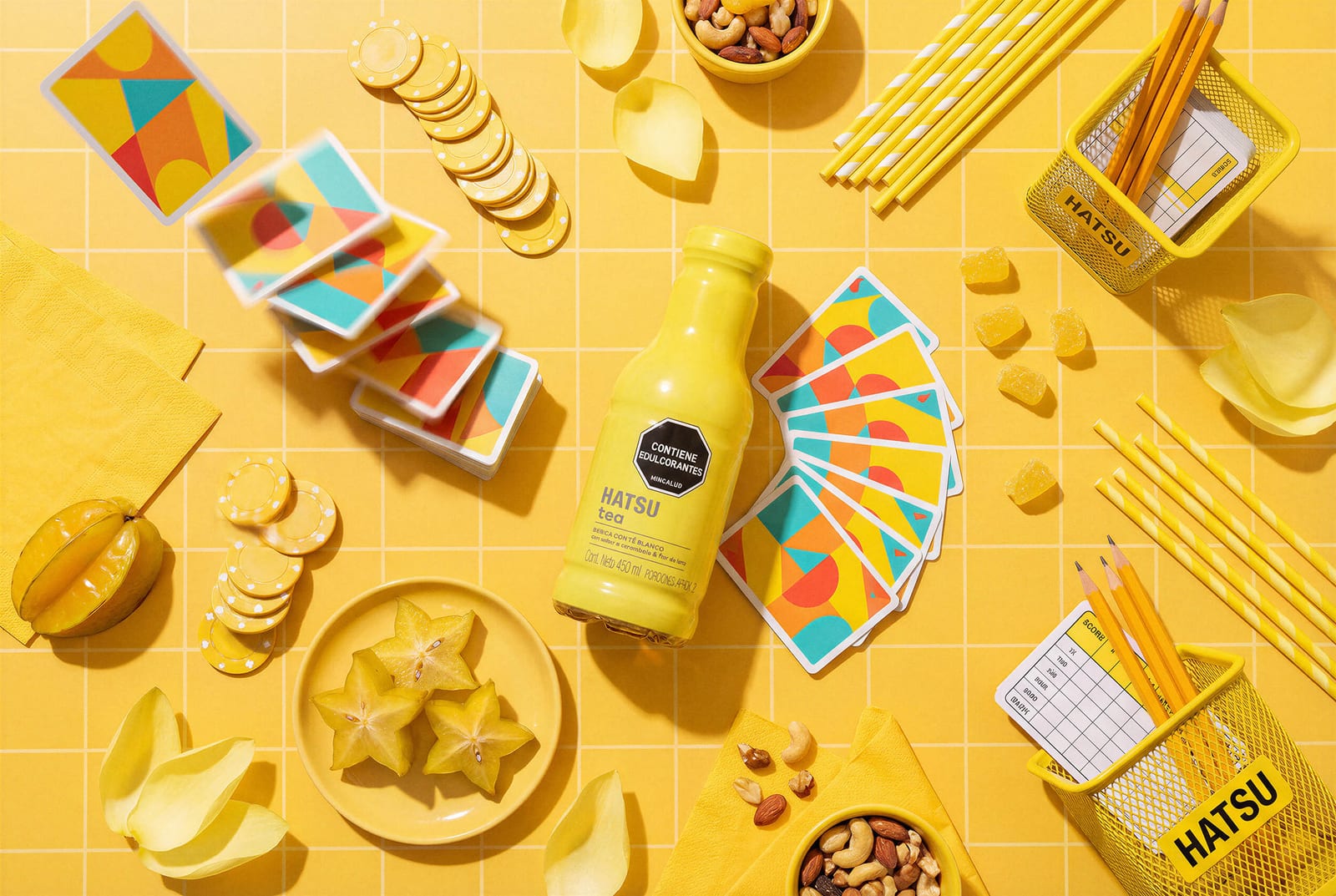
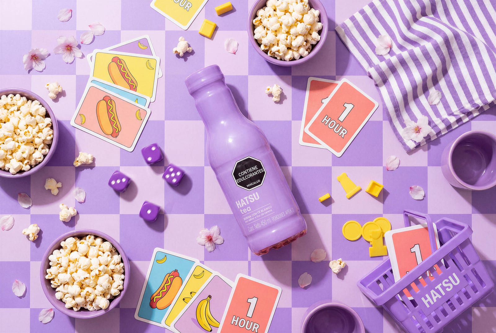
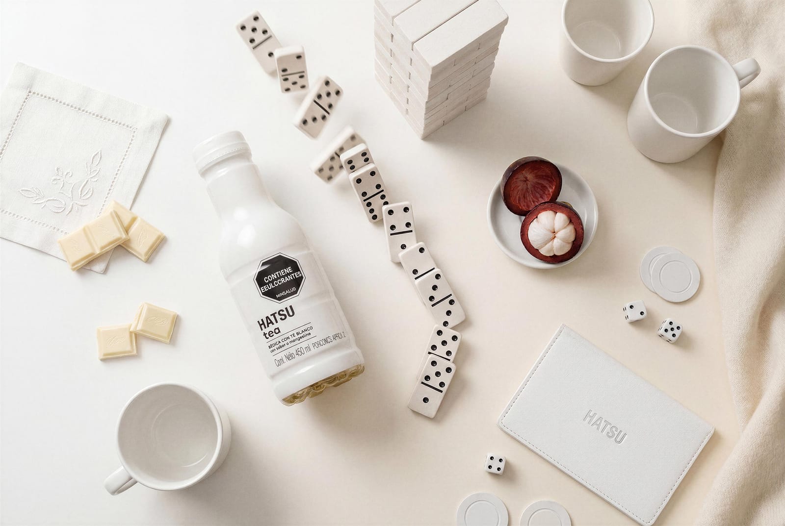
Hatsu Tea. Multi-SKU launch concept.
A coordinated study for a tea house concept. Three flavors, three palettes, one consistent product language. Tests how the workflow handles a multi-SKU rollout.
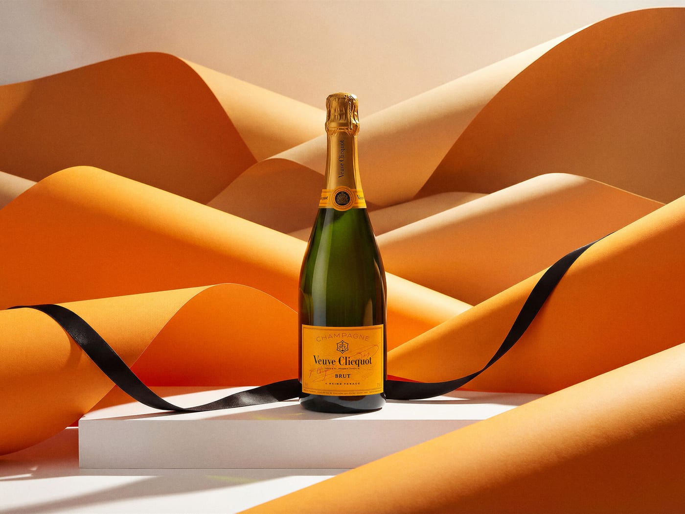
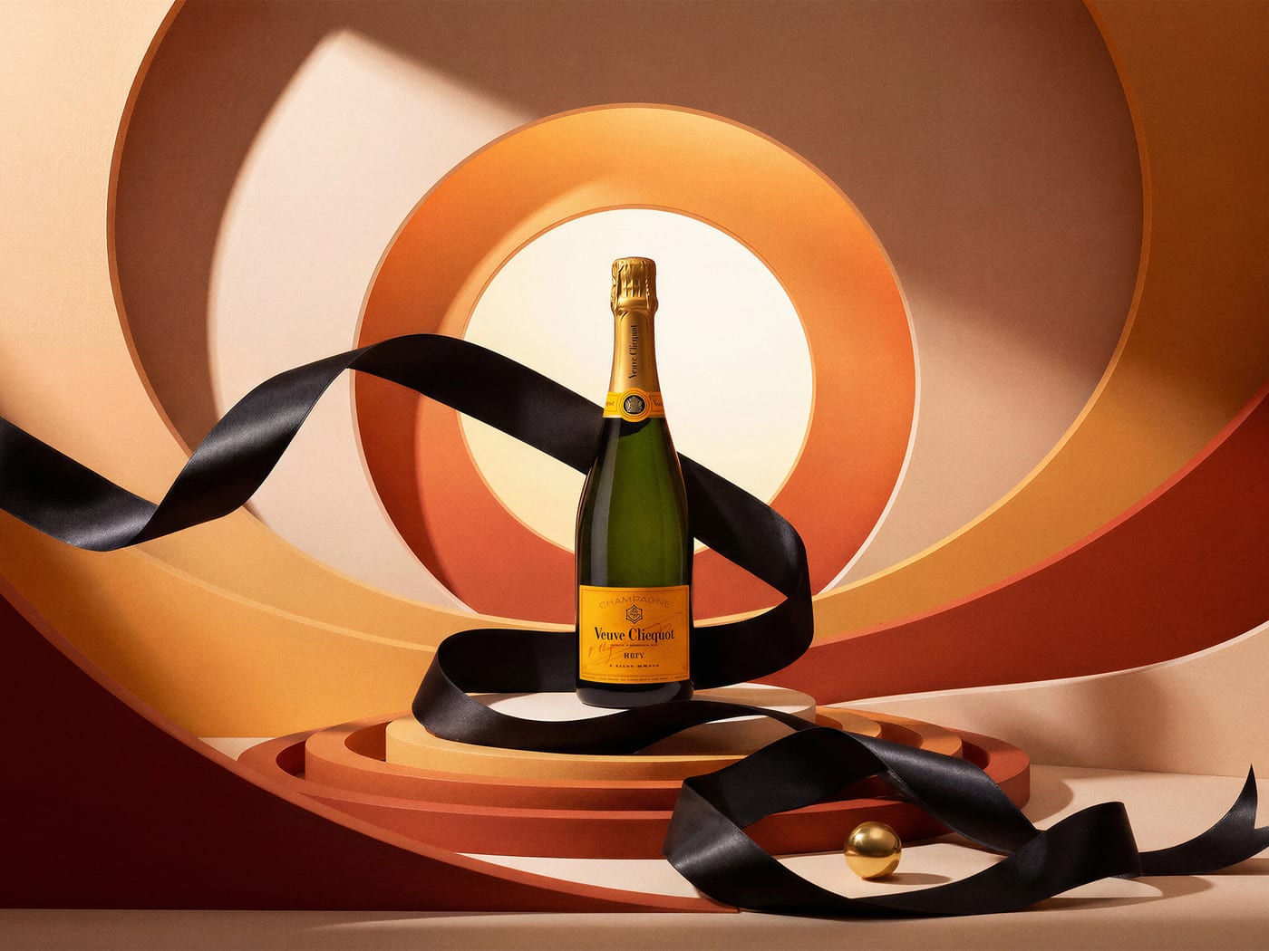
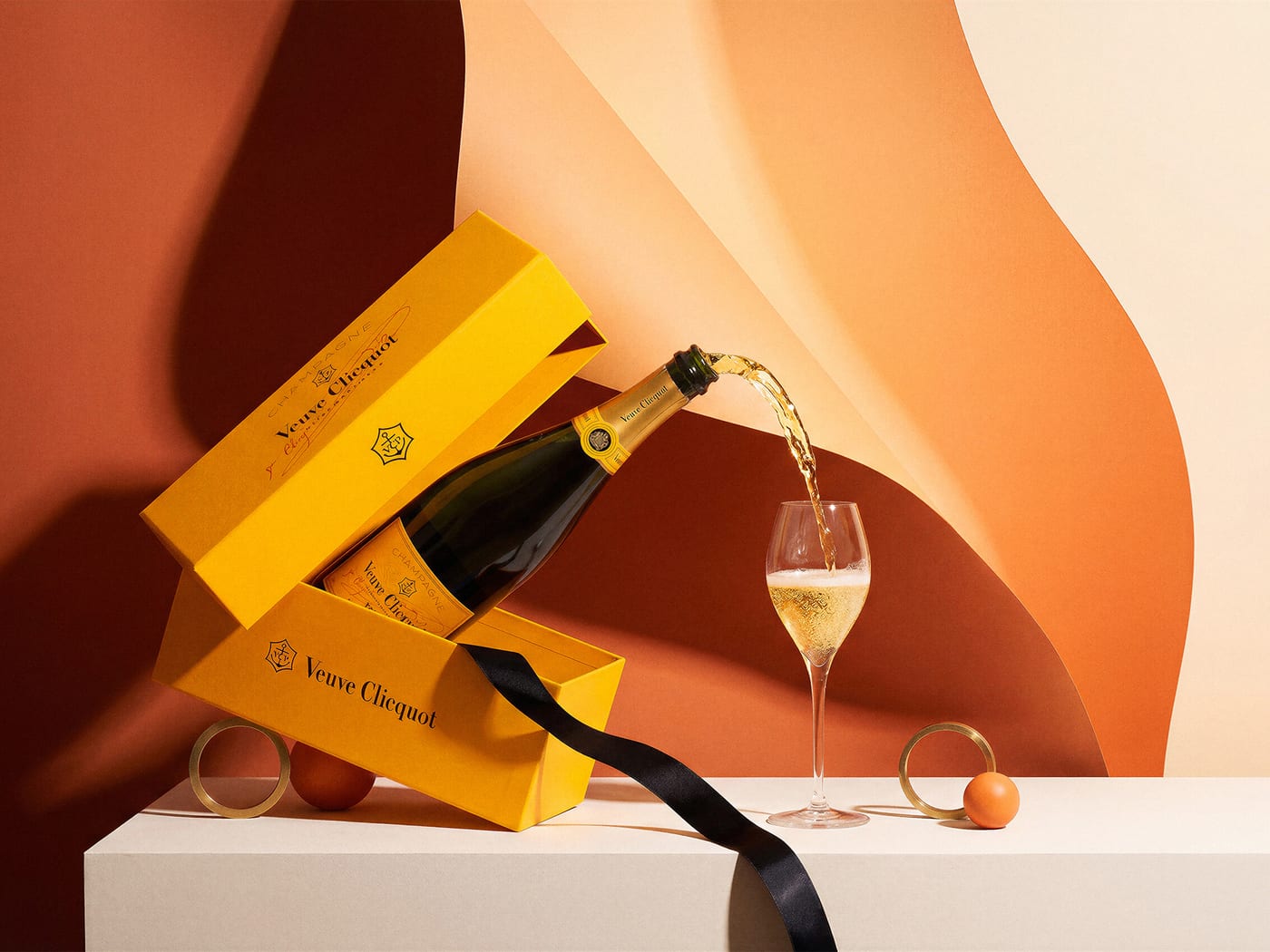
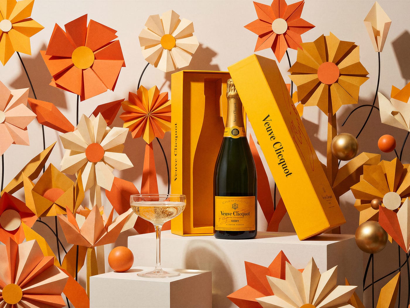
Veuve Clicquot. Q4 holiday concept.
A seasonal photography study built as if for Q4 retail and editorial placement. Four festive frames. Tests the workflow's handling of metallic packaging and warm seasonal lighting.
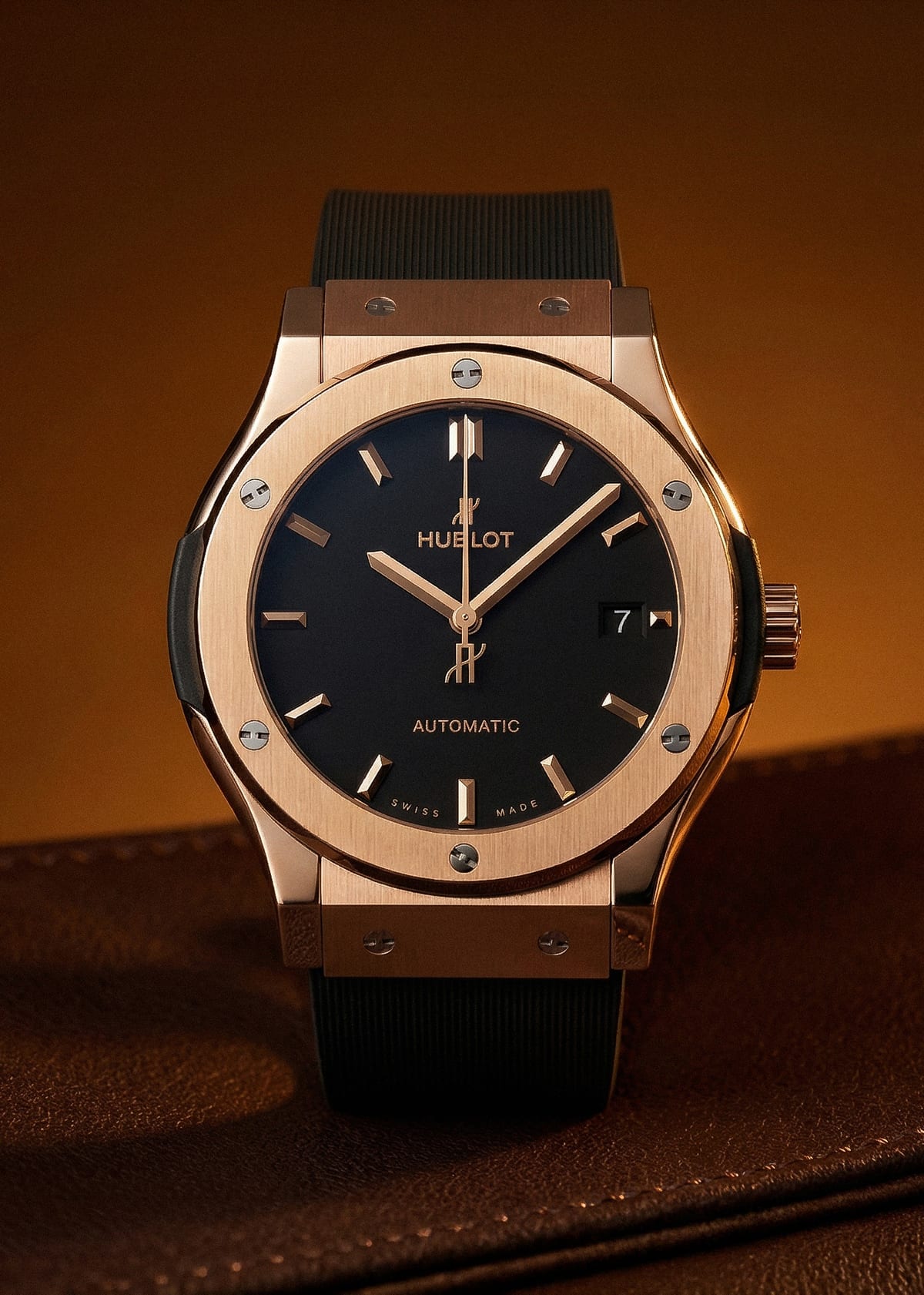
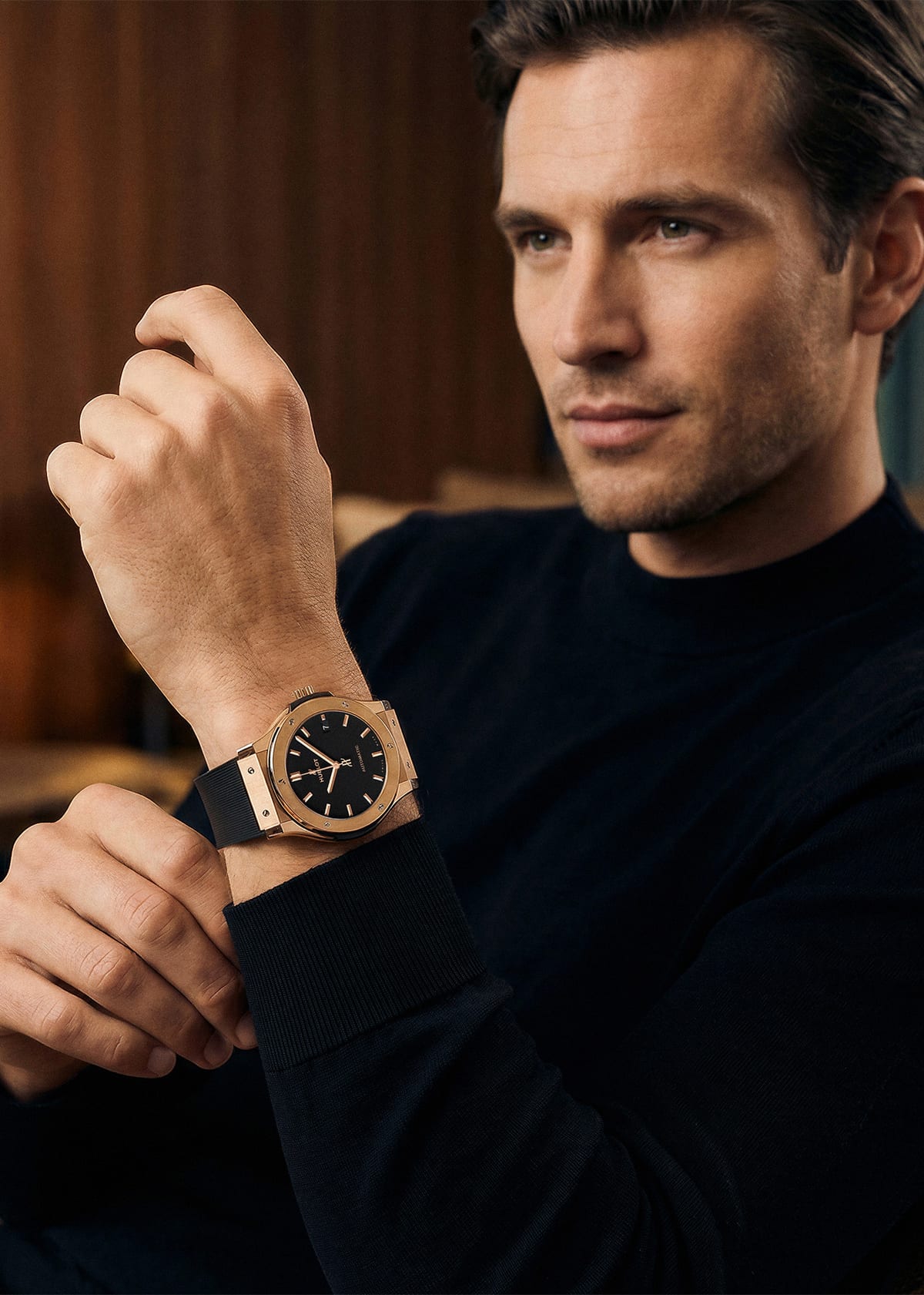
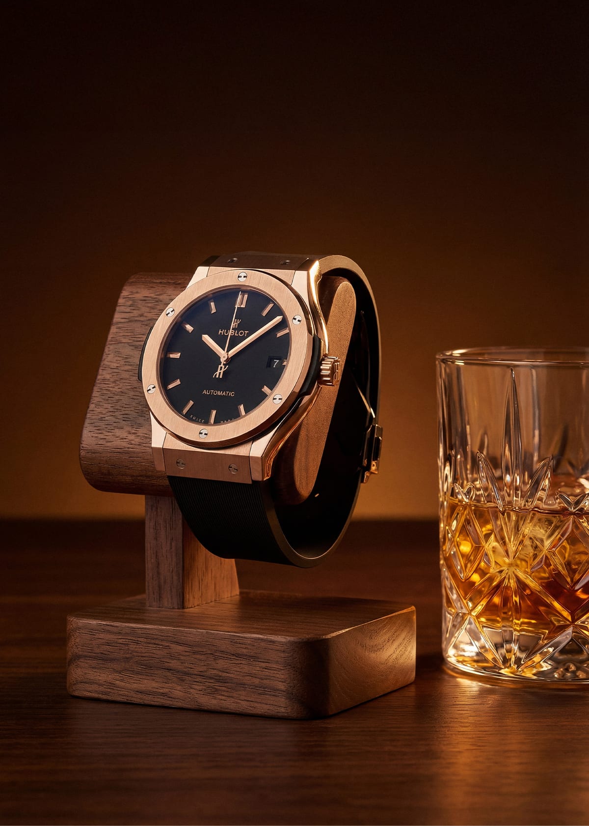
Hublot. Editorial frames concept.
Three editorial compositions for a timepiece concept. The hardest test in the set: reflections, facet detail, and retouching precision at maximum scrutiny.

The logo & identity
The Chronos wordmark sits between serif typography and modern precision. The visual identity runs on premium blacks and golds, a type system built for clarity, and a photography style that lets the work speak for itself.
Brand language
A consistent visual language across every touchpoint. Restrained palette, structured typography, photography that does the heavy lifting.
Visit chronos.studio ↗
Crafting the digital experience.
We designed and built chronos.studio in-house. Dark, modern, restrained. The site does the same thing the studio does: lets the work command attention, explains the process clearly, and makes it easy for a prospect to start a conversation.
Design philosophy
Dark aesthetic with strategic white space. The portfolio work carries the screen. Smooth scroll, minimal interactions. The site mirrors what the studio delivers: restrained, premium, deliberate.
Technical execution
Built with performance and UX as priorities. Full-screen imagery, clear process explanation, smooth flow from discovery to consultation. Responsive across devices.
Strategic content
Every section does a job. Show capabilities, build trust through the case studies, explain the value proposition, make it effortless to start a conversation.

